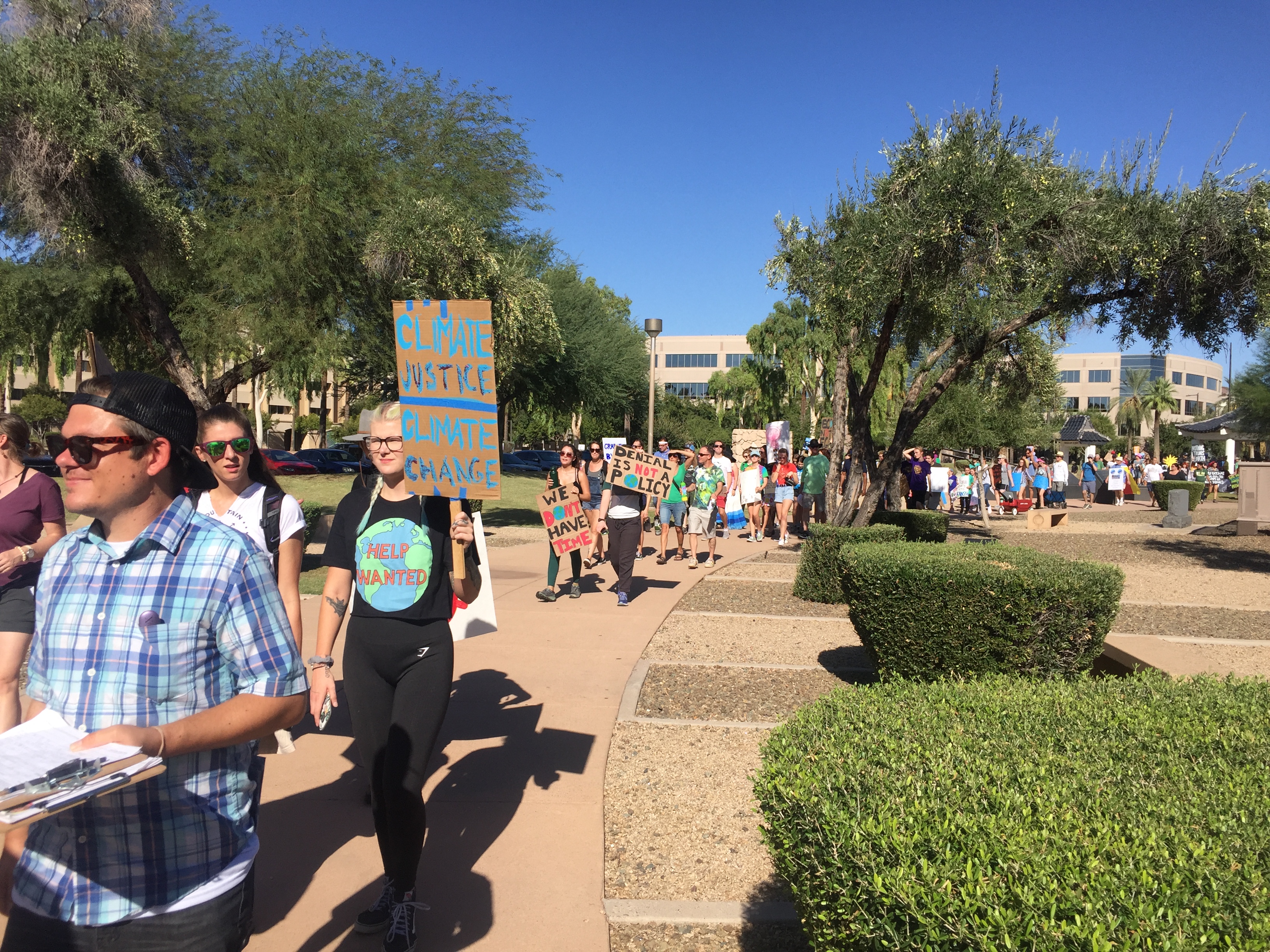

I went to the climate strike on Friday afternoon to show solidarity from the research community with the young people organizing this and other events. The Phoenix event was powerful – the people who organized it put on a professional event that ended at the state capitol and was covered by news helicopters and vans, and the speakers – including Sarra Tekola from my own Arizona State University – were impactful. I was moved by the passion of the people who had made time to be present, to issue challenges, and to be challenged.

I was also struck by the size of the event. There were 500, perhaps 1000, people there in downtown Phoenix. Looking at images from other cities earlier in the day, I had imagined walking in a crowd of tens of thousands of people. How could it be that in our country’s fifth-largest city and fastest-growing county, in a region served by a public university of 100,000 students, that more people did not come? How could it be that in a city at the forefront of climate change, where high temperatures already reach 122°F, where night-time temperatures have already warmed by 9°F in the last 50 years, where the majority of the water comes from drying aridlands rivers, power from Navajo coal and other non-renewable sources, and where 10% of the city’s surface area is covered in parking lots, that not more people felt moved to take part? How could so few people come, when the city has prioritized sustainability and climate adaptation in all of its long-term planning? The question matters for the strike itself, but matters more broadly if participation is representative of public engagement on climate. So where was everyone?
I decided to find out (1) were participation rates lower in Phoenix than elsewhere? and (2) if so, why? There are a few possible explanations for variation in turnout:
Contingent explanations
- Fewer students available due to school policies on absences
- Fewer famous speakers
- Hot weather reducing interest / ability in attending
- Rain storms reducing interest / ability in attending
Structural explanations
- Voting preferences associated with lower engagement on climate issues
- Lower income inequality, reflecting lower overall social tensions
- Lower income, reflecting limited capacity for people to leave jobs to protest

To get at these questions, I decided to make a small and rough comparative study. I decided to study the 20-largest metropolitan statistical areas (MSAs) in the United States. For each, I estimated the turnout at each’s climate strike using news reports. These (except for New York’s 60,000) were not estimated quantitatively, so I assumed that ‘hundreds’ meant 500, ‘thousands’ meant 5000, and ‘tens of thousands’ meant 50000. This is a very rough estimate, but captures the orders of magnitude of variation among cities. I then estimated per-capita turnout – that is, how many people came per number of people who could have come – by dividing by the MSA’s population. Then, I went and estimated variables for each of the explanations above – schools policy and speaker lists by reading news reports (it turns out they are perfectly correlated, so I dropped one), weather as the high temperature on the day of the event, rainfall based on news reports; voting preferences as 2016-election Democratic vote percentages, income inequality and mean income as 1%/99% income ratios using census data. Here’s what I found.

Per-capita turnout in Phoenix was approximately thirty times lower than the per-capita turnout in New York – and among the lowest among our country’s MSAs.
So why? To answer this question, I built a regression model including all of the other variables as predictors, then looked to see what the effect of each variable was after controlling for the effects of all others. The full model was statistically significant (p=0.02) and explained 62% of the variation in the data. But no individual predictor could be confidently assigned a significant role – that is, none of the potential explanations seemed to be sufficient ones. But there were some effects still worth noting.

Air temperature had a negative effect – the warmer the day, the lower the attendance. And income had a positive effect – the richer the city, the higher the attendance. None of the other predictors (storms, well-known speakers, income inequality, voting preferences) show a large positive or negative effect. Interestingly, Phoenix also falls right on the line-of-best-fit, suggesting that, for its size, wealth, and weather, its turnout was typical, and in line with expectations.
But viewed more critically, these results can be interpreted differently: engagement with climate issues with systematically more challenging where heat and poverty are common – that is, exactly in the places where climate impacts may be largest, and most challenging to address.

Of course, these data are quite limited, especially in the quality of the turnout estimates, so the qualitative conclusions should be considered more seriously than the quantitative ones. There is also a possibility that turnout varied due to other differences related to people’s thresholds for attendance, related to their availability, or the diffusion of knowledge about the event (e.g. due to the structure of social networks in each city, or the resources of the organizers). Data for these factors is not readily available, and I can only say that in Phoenix, the event was well organized and easily accessed by public transportation. So I think we must look elsewhere for explanations, perhaps in the structural factors captured by these data, or in the unmeasured structure of the city’s social networks and organizational networks.
Where to go from here is beyond my place to say here. But I think it is clear that the bar for engagement on climate issues is higher in places like Phoenix, despite strong engagement from the city and community stakeholders. The people the strike was not able to include are as important as the ones it was – and I hope that the successes of the day will help the movement better reach everyone who was missing.

Data and code underlying this rough analysis are available for download.
Comments
3 responses to “The climate strike: where was everyone?”
👍 perhaps you should include the percentage voting for Democrats in the model?
It is actually in the model – and it is not a significant predictor. The graphs I included are the partial residuals of the predictors with the largest effects.
Wow, this is an impressive analysis. If we could compare all the information by country, I wonder what pattern it will show. I imagine there might be a turning point to distinguish poor/developing and developed countries.